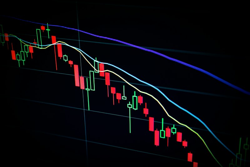
How to Read a Stock Chart (For Beginners)
Charts are visual records of a stock's price over time [1]. They are not magic; they are simply graphs that allow investors to see whether a stock has been trending up, down, or sideways, and to identify patterns that may suggest future price movement [1].
You don't need to master technical analysis—the study of price action and trading volume—to be a successful investor [3], [10]. However, being able to read basic price history helps you understand what has occurred and allows you to ask better questions about why [1].
The Basic Chart Elements
The Y-axis: Represents the stock price. Higher positions on the axis indicate a higher price [1].
The X-axis: Represents time. The left side shows the past, while the right side shows the present [1], [2].
The price line or candlesticks: The core visualization showing price movement [2].
Candlestick vs. Line Charts:
- Line charts: Simply connect closing prices, making them clean and easy to read [1].
- Candlestick charts: Show the open, close, high, and low prices for each specific period [1].
Volume: The Confirmation Signal
Volume, usually displayed as bars at the bottom of a chart, represents the total number of shares traded during a specific period [2], [10].
Why it matters:
- High volume on a price move: Indicates stronger conviction, as more participants agreed on the direction [2].
- Low volume on a price move: Indicates less conviction, which may suggest the move is merely market noise [2].
- Breakouts: A stock breaking out to new highs on high volume is considered more significant than the same move occurring on low volume [3].
Moving Averages: Smoothing the Noise
A moving average (MA) calculates the average closing price over a set number of days, plotted as a line to smooth out short-term volatility [1].
Why traders use them:
- Short-term MA (e.g., 20 or 50-day): Highlights the recent trend [1].
- Long-term MA (e.g., 100 or 200-day): Highlights the longer-term trend [1].
- Trend health: When a price is above its 200-day MA, it is generally considered to be in a healthy uptrend; when it crosses below, it is often viewed as a warning signal [1], [3].
Support and Resistance
Support: A price level where a stock has historically stopped falling and bounced back. It acts as a "floor" where buying interest emerges [1].
Resistance: A price level where a stock has historically stopped rising and pulled back. It acts as a "ceiling" where selling interest emerges [1].
When a price breaks above resistance convincingly, that level often becomes new support. This is known as a "breakout" [3].
Time Frames
Different time frames provide different perspectives:
- 1-day chart: Shows price movement within a single trading day [1].
- 1-year chart: Shows the medium-term trend and recent history [1].
- 5-year chart: Shows major cycles and growth trajectories [1].
- Max chart: Shows the full public history of the company [1].
For long-term investors, 5-year and "max" charts are generally more relevant, while traders often focus on shorter time frames [1].
What Charts Don't Tell You
Charts show price history, but they do not explain:
- Why the price moved [1].
- Whether the company is profitable or its true valuation [8].
- What the company’s business model actually entails [8].
For long-term investors, fundamental analysis—reviewing earnings, revenue, and growth via documents like the Form 10-K—is more critical than chart patterns [8]. Charts can assist with timing, but fundamentals drive long-term value [3].
A Simple Reading Framework
When looking at any stock chart:
- What is the trend over the past year? (Up, down, or sideways?) [1]
- How does the recent price action compare to the 200-day moving average? [1]
- Are there significant support levels below the current price? [1]
- Was any recent major move accompanied by high volume (conviction) or low volume (noise)? [2]